How to format text on a website: best practices
Often, when people order website development, they create standard template elements with a designer without considering how they will post articles to the blog or how to achieve good visual elaboration.The first posts go live, and suddenly you need subheadings, lists, images, quotes… but the template never planned for them. You’re back to the designer and developer for extra rounds and extra invoices.
Do it once, do it right. Plan every content element during the design phase. You’ll save money, time, and sanity, and end up with articles that actually get read.
This guide lists the most effective formatting tricks, flags common developer slip-ups, and shows how to avoid them
Why Text Design Matters
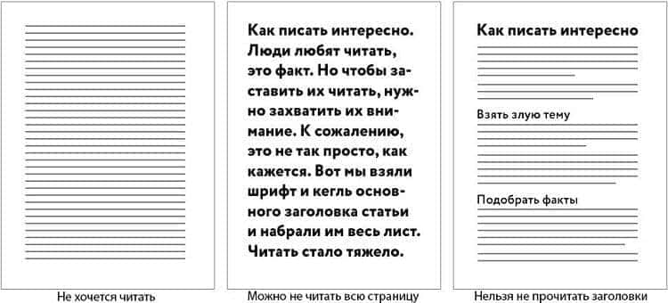
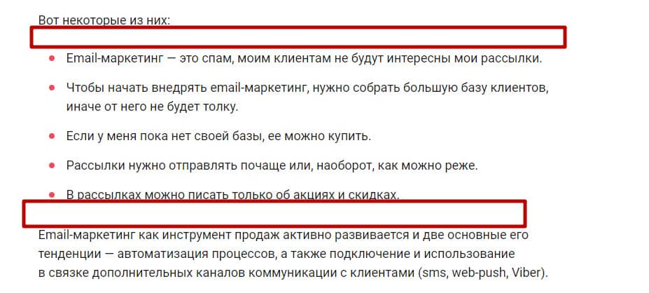
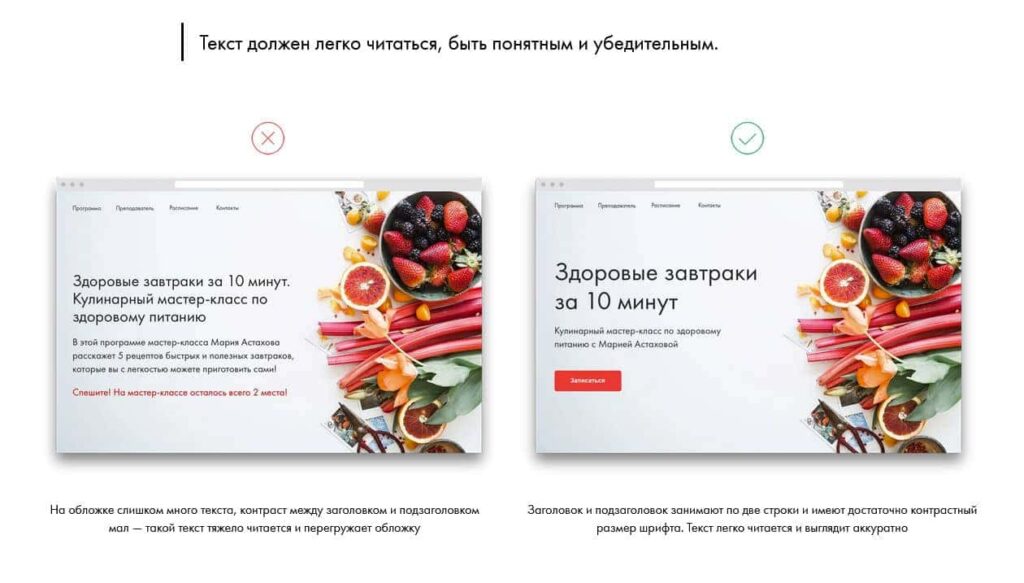
It’s been said a million times by bloggers: articles should never be endless walls of text that bore readers and make them want to close the tab. Here’s what that looks like:
There is nothing to catch the eye in such an article. For ease of perception, an article should include visual accents. Ilyakhov's editorial newsletter has excellent visual examples of how to design text on a website:
Make your articles visually catchy through inline elements and subheadings.
Mobile-first rule: 70 % of traffic is on phones. Every embedded element must be fully responsive on smartphone, tablet, and desktop. Otherwise your masterpiece is invisible to most visitors
Clean HTML Only
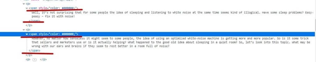
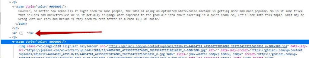
When you copy text from Microsoft Word or Google Docs—even if it’s perfectly formatted in the document—it arrives on the site with extra markup that clutters the code. Usually these are <span> tags with their own styles, line break tags </br>, etc.
An example of one of these is here:
At the same time, on the website, it looks like this:
You have to agree, it doesn’t look very presentable — and that’s all because the code clutter hasn’t been cleaned up.
Avoid using <span> tags and styles via the style attribute to edit fonts in the article text, as this significantly increases the page code length. Besides, it takes a lot of time to make the whole article the same. Use classes with centralised properties in CSS files for all visual designs. If you're not satisfied with the fonts and appearance of the text after laying out the clean code, it's better to ask the programmers to centrally edit the display of elements. Then all articles will look the way you want them to look in one edit.
Do not allow line breaks in paragraphing with the <br/> tag in the text. If you need to create a paragraph, use the <p> tag.
Very often, copywriters make paragraphs in MS Word documents using line breaks rather than centralised spacing like <p></p> to make the text easier to read:
Don’t create vertical spacing this way (with empty <p> tags). If you need more space between paragraphs, it’s better to fix it centrally through CSS classes for <p> tags or any other relevant tags.
Try to keep the spacing modest so that it supports readability rather than looking like this:
And here is an example of the correct use of spacing:

If the spacing looks incorrect, then their styles should also be corrected centrally in the site template.
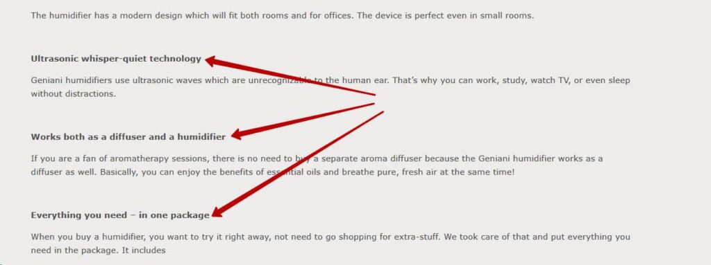
If you need to emphasise some information, highlight it with subheadings, italics, bold, additional elements and so on:
The following tags are allowed for the design of texts on the site:
- <p> - paragraph tag;
- <ul><li> and <ol><li> - bulleted and numbered lists;
- <b> or <strong> - bold;
- <i> or <em> - italics;
- <u> - underline;
- <a> - links;
- <img> - pictures;
- <del> - strikethrough text;
- <h2>, <h3>, <h4>, <h5>, <h6> - subheadings.
In some cases, other tags may be used in the text, but this is extremely rare. Basically, the pure code of articles should consist of tags listed above. All their styles should be written directly on the page template.
Headings That Work for Readers and Google
Often, inexperienced copywriters make subheadings in articles in a Word file simply by highlighting them in bold, and when transferring articles, they are laid out the same way:
You don't need to use simple bold for headings in articles, as they have their own set of <h1>, <h2>, <h3>, <h4>, <h5>, and <h6> tags. Aside from the visual appearance, all title tags are handled a little differently by search engines than plain text, and key queries in them have a slightly better effect on the ranking of an article than queries just from text. So it's important to use them correctly.
The h1 header on the page should occur once and in the article should denote exactly the title of the article, not some design elements. It can be like this:
Or like this:
Further on, the text uses subheadings h2, h3, h4, h5 and h6, and there can be an unlimited number of each. On average, one subheading for 500–750 characters.
At most, one subheading can be for 1000 characters, but on the condition that such large blocks of text are separated visually by pictures, lists or tables. An example of such a thing with a picture:
Subheadings should stand out in size first:
- The H1 tag is the largest size tag on the page.
- The H2 tag should be the next largest tag.
- The H3 tag should be the next largest after H2.
- Other heading tags may follow in descending order of font size up to H6.
- Even the H6 subheading should visually stand out against the background of the main text blocks (fonts, indentation, colour, boldness, etc.) and look like a subheading.
Example:
You can design H2 subheadings with a picture as a background:

Or just eye-catching styles:
And the rest are already highlighted only with fonts without bright additional elements.
Don't use third-party tags like <span>, <strong>, etc. inside subheading tags like:

Make all edits to subheading styles centrally via CSS and classes. This rule should be especially strictly adhered to in the H1 header.
Subheadings should create a hierarchy in the article when forming its table of contents. Example:
- section with h2
- child section with h3
- child section with h3
- deeper subdivision h4
- deeper subsection h4
- child section with h3
- section with h2
It is not necessary to use only one type if the article has a complex structure, as a hierarchy should be established.
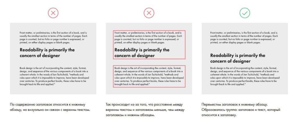
Subheadings should be indented, but they should be small and consistent at the top and bottom. It's even better if they visually combine the headline and subsequent text into a group. There's a good explanation on this from the Tilda team:
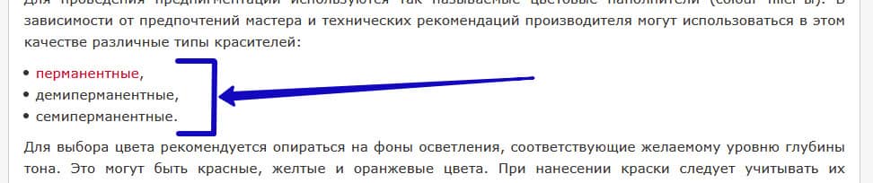
Lists - readable and consistent
Use bulleted and numbered lists to improve readability and structure. In principle, modern copywriters mostly make such lists for enumeration when writing articles. Further, it is important to correctly embed them in the text, as these tags are provided on any site. However, during site design, they can be forgotten, causing them to appear crooked after publication.
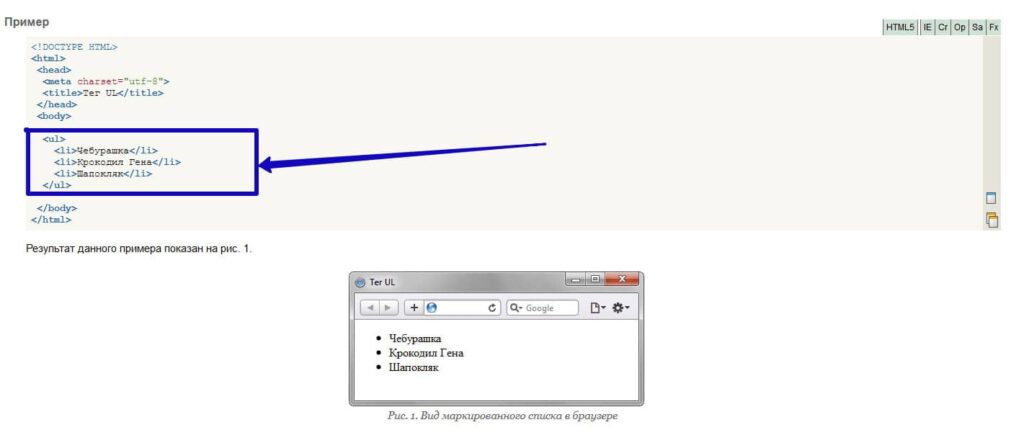
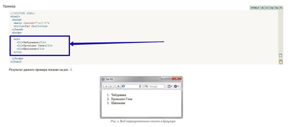
These lists have their own syntax in the layout. This is how, for example, the clean code of a bulleted list and its display looks like:
And here's how it's numbered:
Text between closing and opening <li> tags should not be framed additionally in <p> paragraph tags, which is usually the case if you transfer content from Word without code edits. Otherwise, you'll get extra indentation between list items, not always pretty, like:
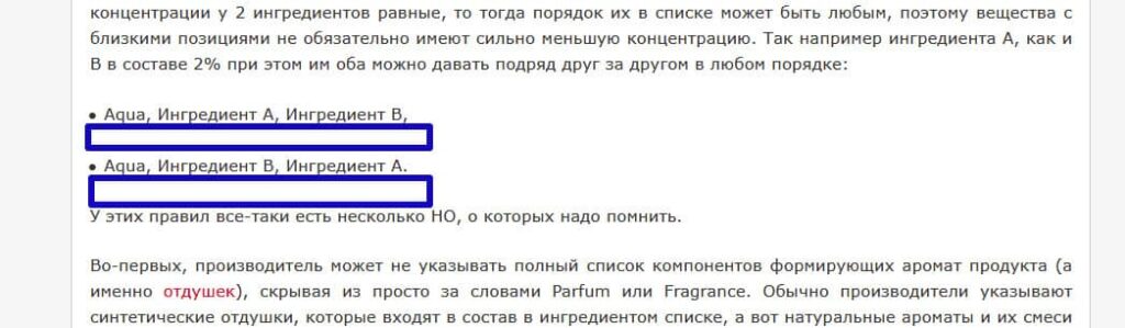
Therefore, be sure to remove all of this when laying out the article.
Ensure that numbered and bulleted lists have the correct appearance in the article when laid out, specifically a small indentation to the right of the left edge of the text block, compared to normal text, and a marker/numbering. Examples:
It happens that in the layout of the site design for lists, remove indents and markers, then when laying it out looks like this:

It would also be optimal if immediately after the main text and before the list, and similarly after the list, there was a small vertical indent, like:
And the vertical distances between the list items should be such that these items visually merge into a single block, and not look like detached sentences. Here you can clearly see the grouping:
Links - make them obvious
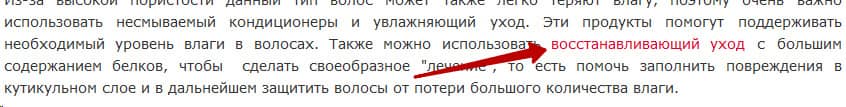
For articles, it is mainly important that when reading them, the audience is engaged and moves from one article to another on the site or leaves the article altogether to go to another site (especially important in projects that try to transfer users to other sites from their own by affiliate links). Therefore, it is obligatory to specify links to other documents and even sites in the articles. But it is not enough just to indicate; the links must be clear enough for users to understand where to click on the page at first glance at the article. Therefore, links should have such a style setting in CSS that they are visually different from the rest of the text by colour, even when not clicked, like:
You can make it so that when you hover over a link, its colour changes and the link you click on has a different colour altogether, but this is not critical.
For blogs and online publications, where it’s important to encourage deeper navigation into the site, you can also place links to your other articles within the text where needed, formatted like this (with side wrapping):
If you plan to actively link to other sites from your articles, and do not want them to transfer your link weight, but still want to be able to open the final site for users by clicking, then make such links through the script SEOHide. Such a script can be implemented by a programmer on your site and give recommendations on how to use it.
A script is a script of commands written in a special programming language, which can be run independently at the right moment in accordance with the logic embedded in it. Scripts are read differently by search engines (SE) than ordinary text and HTML-code, so you can use them not to show the SE separate fragments of the page or, for example, to replace a text fragment with a link that can be followed by the user, but which is still visible to the SE as just text (as in the case of SEOHide).
When implemented correctly, in addition to regular links, you will also have these, and when necessary, you can apply them specifically when formatting an article or news item. And when formatting articles in the admin panel, you will write regular links with separate tags, and those that will be in the script with separate tags. This script must be embedded in the code during the website development stage, and the visual design of such links must be ensured to be similar.
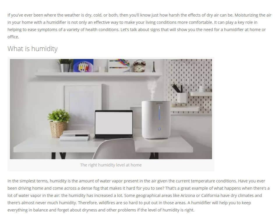
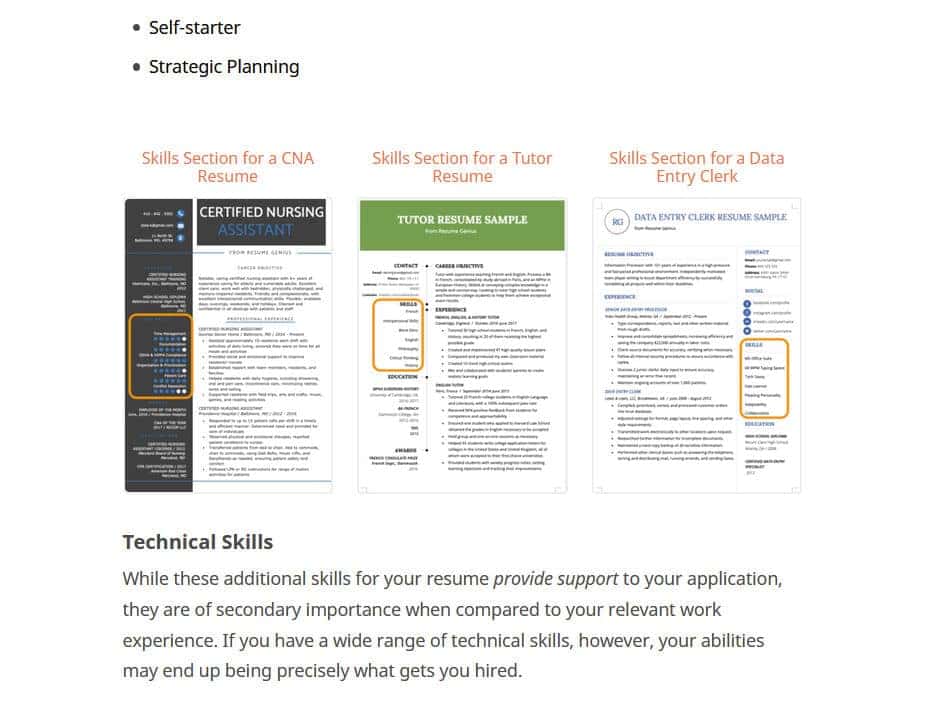
Images
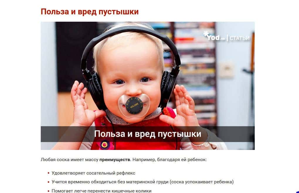
Pictures help the perception of the text if they are clarifying, and can also dilute it if they are neutral.
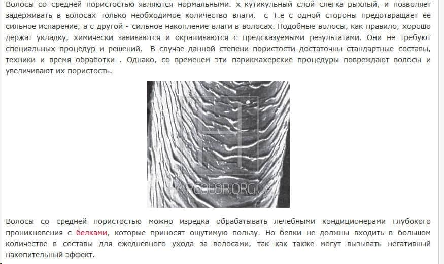
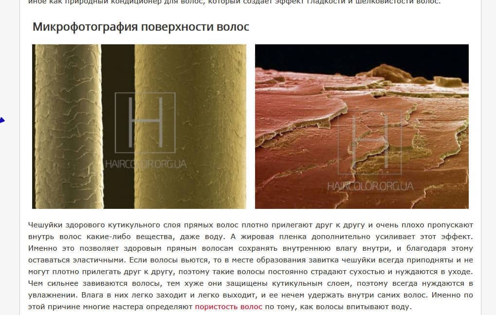
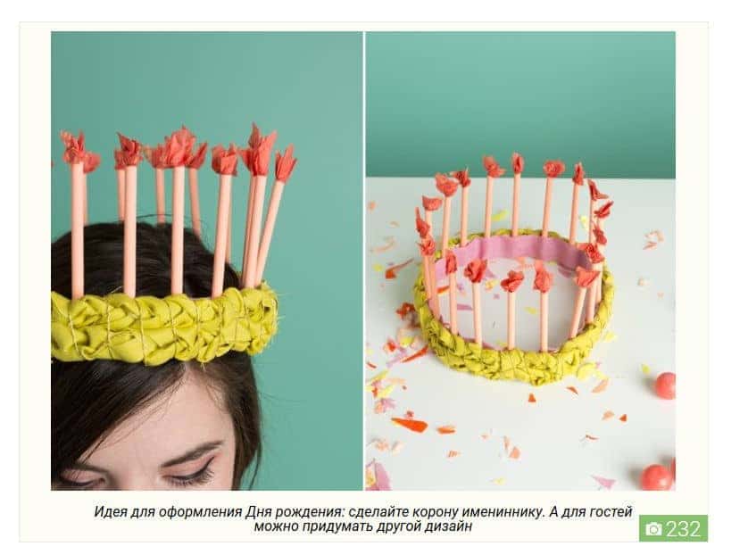
Here is an example of a clarifying use of pictures, when they really complement the text with a visual explanation:
And here is an example of a neutral picture in the text:
When it simply adds visual effects-accents, but does not carry a strong semantic load.
Please note!!! If there is no possibility to make an adequate clarifying picture in the topic, it is better to take a picture that is close to the topic and overlay it with a thematic phrase, advice or subheading text, as is done in the above example, than to be left without a picture at all.
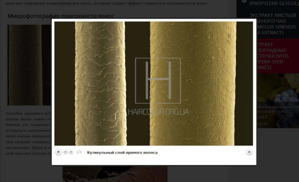
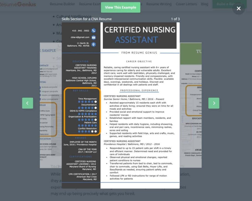
If there will be pictures in articles, which users will need to view in detail in an enlarged format, then allow the picture to expand over the text with a modal window, such as:
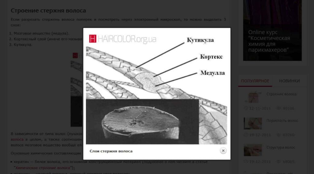
On the one hand, this solution will allow you to look at the picture in detail, but on the other hand, it will not take the user away from the article. That is why you should not open a picture as a separate page.
To make an article look good, you should place 1 picture, as well as any other visual element (video, tables, boxes, quotes), for 750–1000 characters of text. If the article's narrative logic should include more pictures, it is not terrible; the main thing is to separate logical groups of pictures with text. But if the gaps without pictures are larger and there are no additional visual elements such as tables, lists, tips, etc., the text will look boring:
In some topics, such articles will be the norm (e.g. law), but for most topics, they will not be good.
Photos should be able to have unique, beautiful captions, like here:
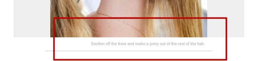
If you have a picture that complements the content, the caption is a field where you can provide an explanation that will really help the user.
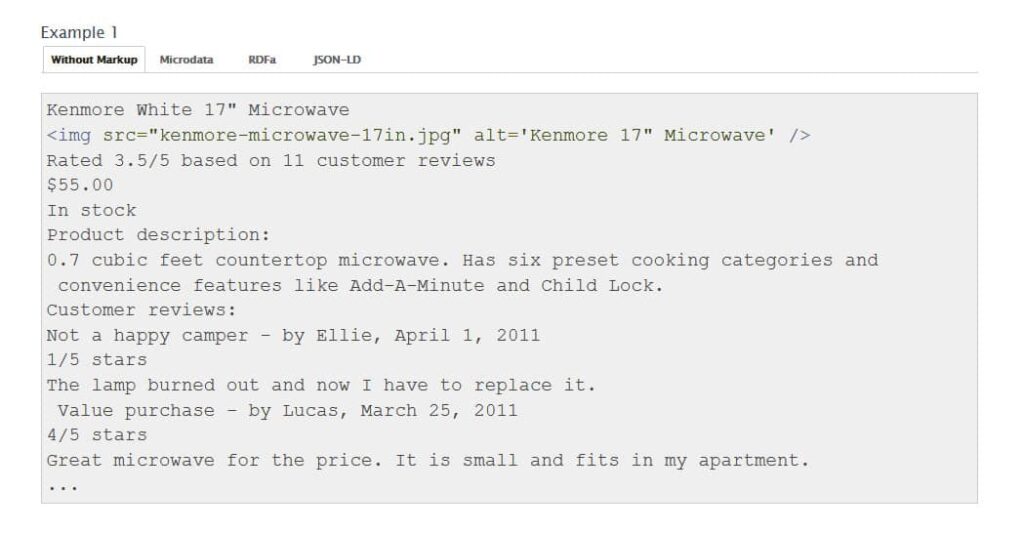
For all images, the unique alt should be prescribed. As you know, alt text is considered when ranking pages in search, so it is important to fill it in for all pictures.
The alt attribute of images is the text describing the image in the HTML tag.
Galleries
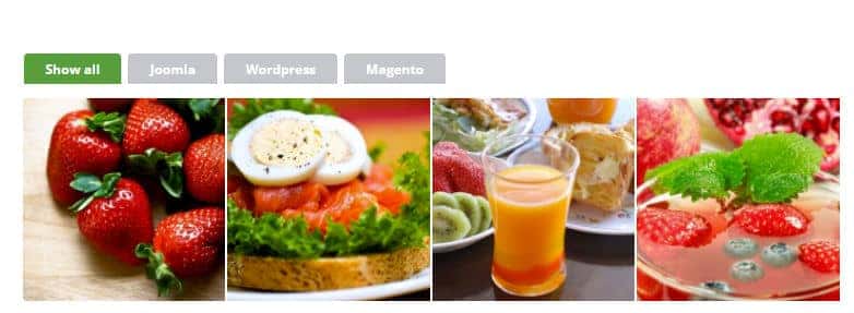
If you need to place several pictures in a row by content, it is better to use the gallery functionality for 2–4 pictures in a row, rather than pictures one below the other. Gallery example:
When you click on a picture, a modal window should pop up with the ability to scroll through all the pictures in the gallery in full size:
It's common for beauty blogs to display many photos on a topic within a gallery, and this is something to consider if you have a similar problem. There are a lot of options for the visual design of galleries.
For example, by tagging images:
Or with a leaf blower:

If you have a very large number of pictures in the gallery that you need to show exactly in the first block, you can use a gallery that shows the number of pictures and previews 1–2 pictures with a description, like:
The user can then view the rest of the gallery in a modal window.
On the Vogue website, galleries with scrolling are shown directly in the text, and it is possible to look at all the images without using modal windows:
For a number of sites, where you do not need to enlarge pictures further, this may be a good solution. But if you need to enlarge the picture, then this option will not work here.
Please note!!! All photos should have unique alt tags for each picture, and galleries are no exception.
Placement of images in text
Place images in the text with the alignment in the middle, as it is done here:
Or make the pictures the width of the text, as done here:
This way, they are much better at visually separating the text into blocks than the above example:
It is desirable that pictures should be wide, not tall. But if there is no possibility of using the wide variant, then the middle alignment will save you.
Left-alignment or right-alignment variants in the text of an article may look more unfavourable (especially if the text area is narrow):
You can use alternating picture blocks, but they should be non-annoying, logical and the same width. Example:
Image Comparisons
If you develop designs or other creative works, it is effective to show comparison style designs (before and after), so here:

or here:
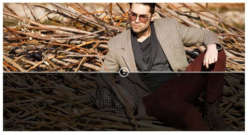
Such a solution will tell more about your work than thousands of words of text.
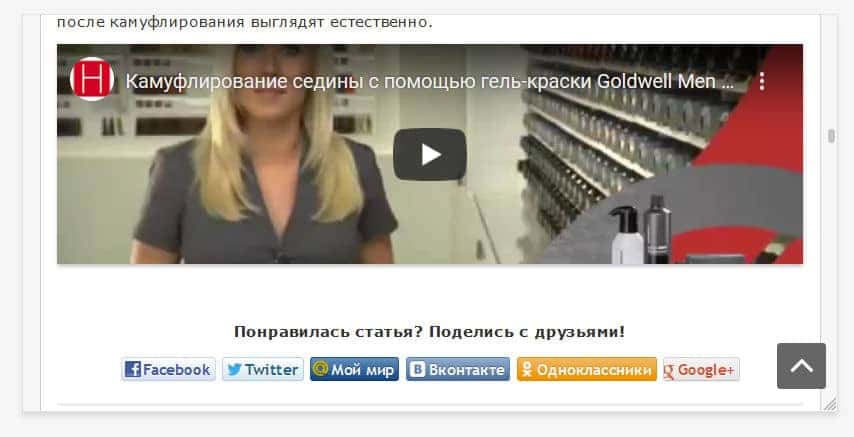
Video
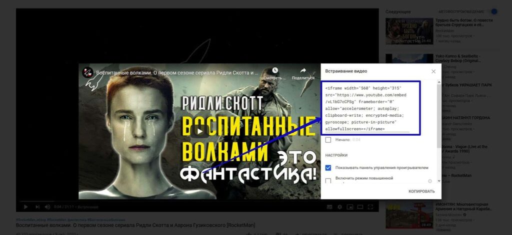
In most topics, video will be a great addition to the article's text. Therefore, it is important to provide for the possibility of embedding it in the text of the article. The easiest option for most users is to embed a video from YouTube, Vimeo or similar services on the site. And it would seem that what could be easier? YouTube itself gives the player code with the video as an iframe, here:
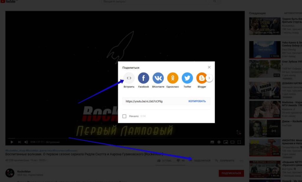
Copied it and pasted it into articles and that's it:
Everything… and yet not everything.
An iframe is a page code component that allows you to embed documents (video, audio, documents, etc.) on a page directly from another page. In this example, your video, along with the player, is on YouTube. However, the iframe allows you to upload it directly from YouTube with all the design as if it were on your site. You don't need to install an additional player, as it will be downloaded from the YouTube server. Similarly, you can embed documents from Google Drive and audio files from podcast services. All of them will send both the visual elements for display and the files themselves to the site as soon as the iframe code is inserted.
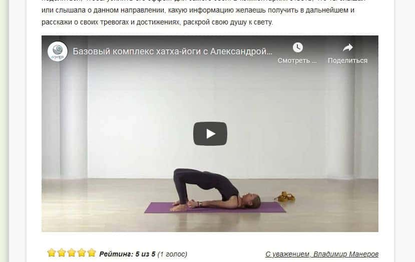
Video should be embedded in the article harmoniously, as an addition to the article: a separate content floor in the middle of the article or a final chord, as in the example below:
You don't want to make it with the text flanked on the sides by a small box:
Don't force users to make an extra click to enlarge the screen, because in most cases, they will just scroll through it, but you want them to linger and ideally even watch it to the end. It is important to provide the correct size of the viewing window in advance.
But also don't forget about mobile users. If you just meet an iframe tag from YouTube in the page code, even with the correct dimensions, your video will look beautiful on a desktop, but it will most likely be much larger than the screen on a smartphone or displayed in the wrong proportion. And it won't adapt to the screen size properly. Example:
Therefore, when developing sample pages, it is necessary to ask programmers in advance to create at least one article block with a video in an adaptive layout, enabling similar blocks to be made in other articles.
Pay attention! In some CMS sites, you just need to prepare an HTML example for video embedding and then copy it, replacing the video address from article to article using HTML tags. However, for some CMS systems, there are already pre-developed plugins that simply require you to correctly specify the shortcode with the video address in the page code, and then the site will do the rest itself.
If you plan to insert videos from the hosting site, you definitely need the initial configuration of the programmer. Here, you cannot do without it.
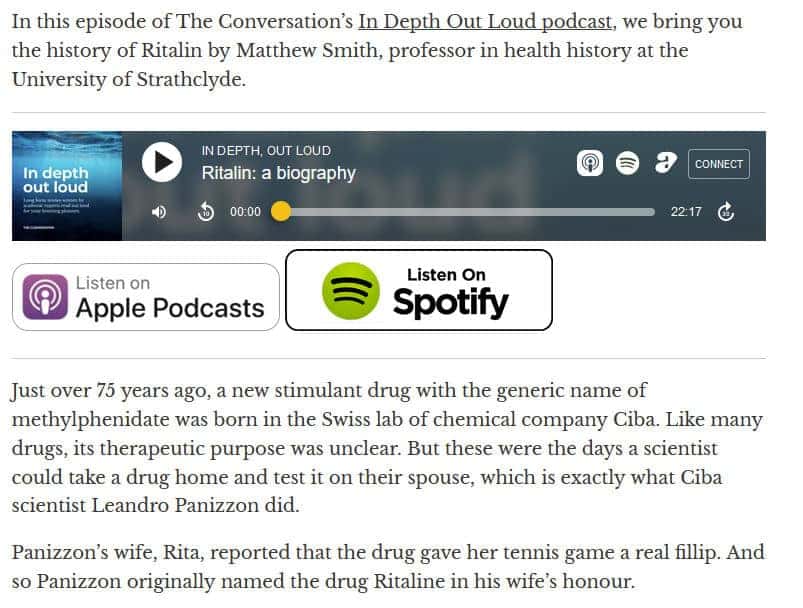
Audio
Personally, I'm not a big fan of podcasts or audio content unless it's music, but many users prefer audio content to reading. In several topics, supplementing an article with audio is a great alternative way to experience content. In this case, it is worth choosing a service in advance where your audio will be published and embedding the service's player on the site. Example:
If you want to do the same thing exclusively within your site, without resorting to third-party services, you can't do it without a programmer. In addition, the player's design will need to match the style of the site.
Social Media Embeds - Instagram, Facebook, Twitter, etc.
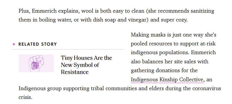
If you are making a news publication or an online magazine, you cannot do without inserts with quotes from famous people, their posts on social networks or photos. Example:
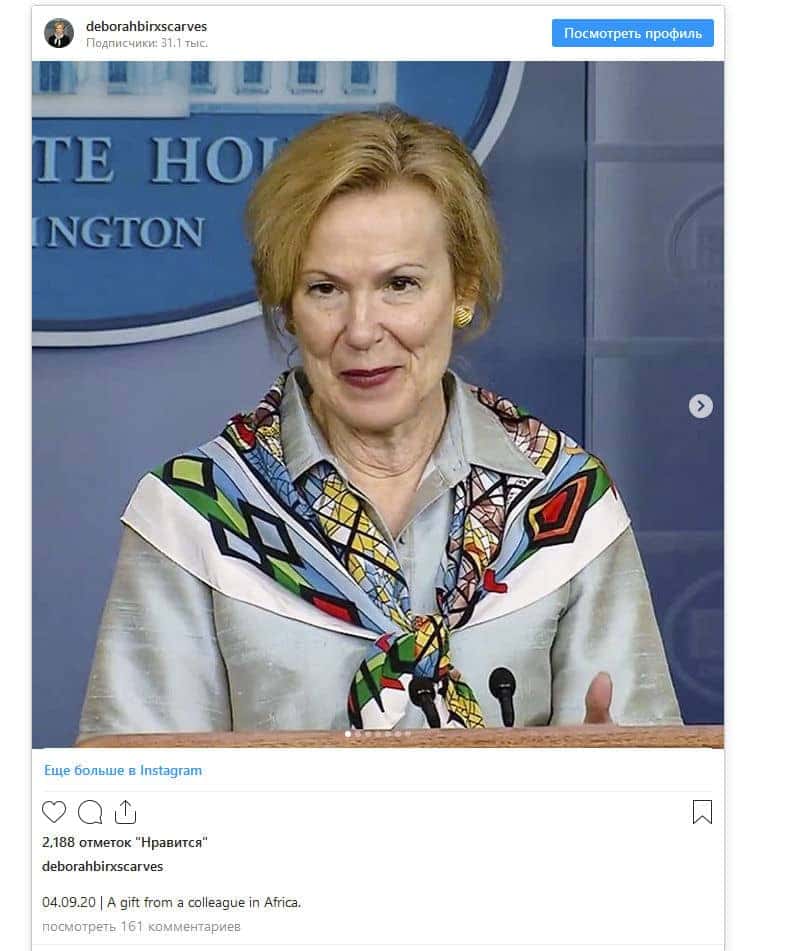
Such embeds themselves work on the same principle as YouTube and give you a ready code for embedding. However, it will most likely not be adaptive on your site by default, so it is important to consider this point in advance to avoid issues with the article's display on a smartphone.
Table of contents
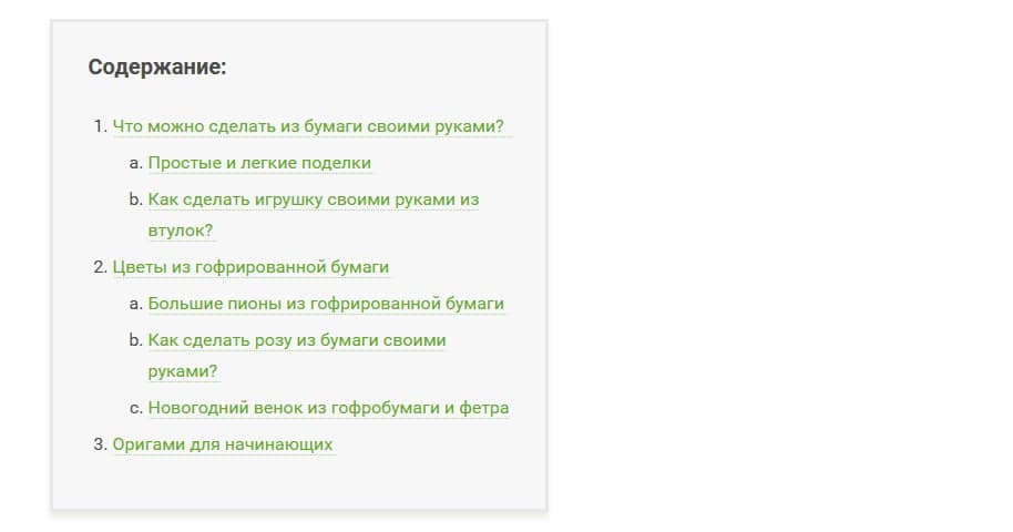
If you like to write long reads, as I do, make sure to make a table of contents with anchors, in which each item, when clicked, will take the user to the corresponding section (subheading) of the article. Like here, for example:
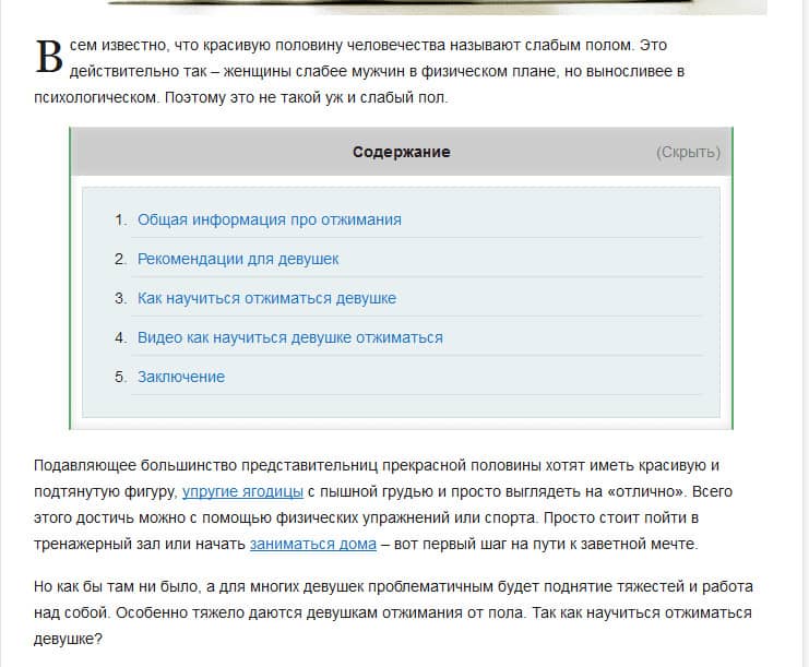
- It makes no sense to create fractional tables of contents in articles of 2000–3000 characters, but it is problematic for many users to read an article of 8000 characters or more without one. Especially if you need a specific fragment from the whole article.
- When creating tables of contents, it is worth noting:
- If the article has a complex structure and headings of different levels h2, h3 and further, it is better that the menu is not as in the photo, but multi-level, for example, as here:
- In addition, if there are indeed a lot of sections and the menu is large, it is worth providing the functionality of hiding the menu, so that it loads by default in collapsed form, but the user can expand it, if necessary, with a single click (example):
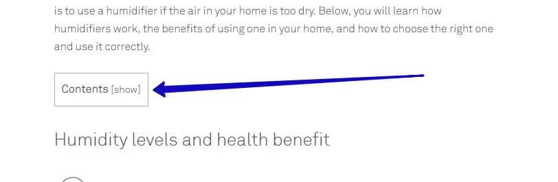
Don't forget about the menu display on mobile. It should be no less convenient than on a computer.
Tables
In some themes, especially technical ones, you may need tables to display useful information. By default, when sketching the design of the block, such a design is often not laid down. Therefore, if the table is simply hand-drawn, it may not look very readable, especially on mobile devices.
The design of tables itself can be different:

Or:
Or:
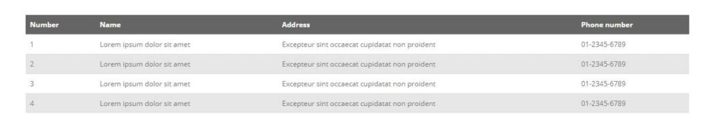
There are a number of points in table design that you should pay attention to:
- Column headers should preferably be highlighted in colour or style amongst the rest of the table (as seen in the examples above).
- Tables should display correctly on mobile devices and have their own horizontal scroll via CSS styles. This is not the browser's own scroll (because otherwise, Google will assume the page is not adaptive), and if it is a layout scroll, then Google has no claims to the page.
Example of a display of a table on a desktop:
and it's on her mobile:
In this case, the columns and rows have even rearranged themselves, swapped places, and there is an internal scroll.
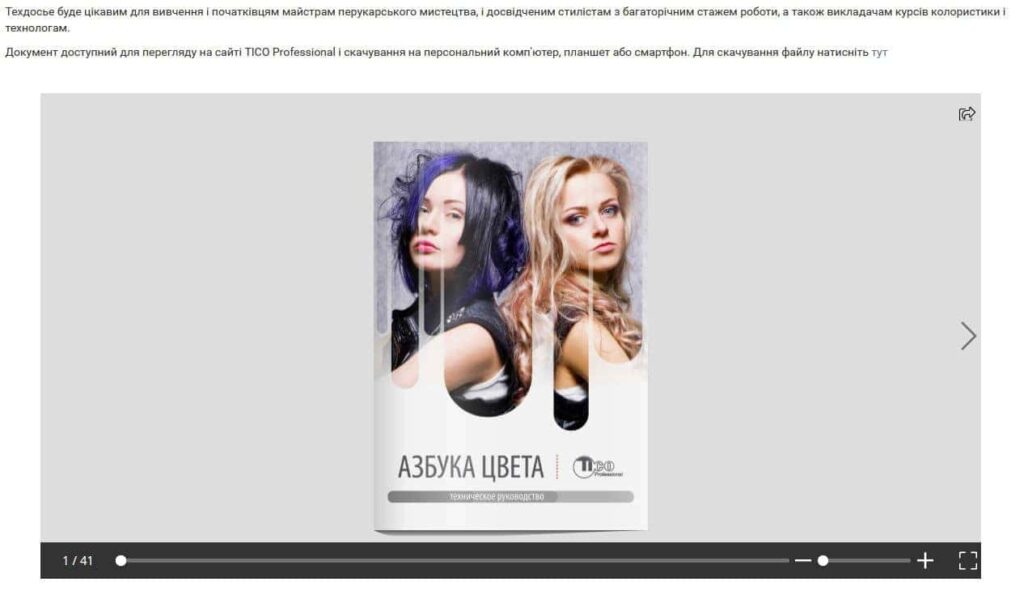
Document Previews (Images)
There are topics where it is important to show examples of documents, and they can also be used as visual content. If this is your case, make it so that a small preview of the document is displayed - a thumbnail (several in a row):
And then when clicked, the document would expand completely over the window - example:
This solution, on the one hand, will provide a variety of visual designs, and on the other hand, will give an opportunity to examine the document in detail, if it is of interest to the user.
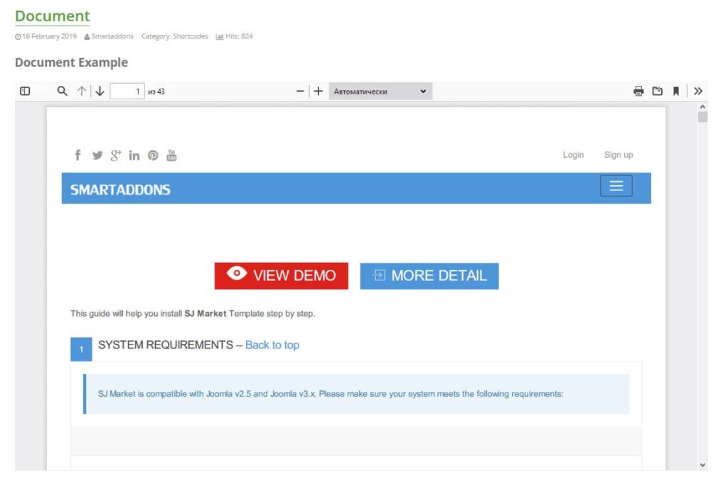
Embedding PDFs, Presentations, etc.
There are topics where you need to embed an entire PDF document or presentation into an article, allowing users to scroll through and read it directly on the page. Optimally, the display of documents on site pages is done similarly to the way YouTube videos are placed in articles, with the only difference that for displaying PDF files and presentations via iframe, there are quite different services that allow you to upload the required document and then insert its iframe into your page for display.
For example, for publishing PDF documents, there is a service Yumpu.com, which allows you to upload the document to yourself, configure its display for third-party sites and then insert the resulting code directly into the page. The use of this service does not require the intervention of programmers, as the adaptability of this block can be regulated by the settings of the document display in the administration of the service itself (example):
And then the embedded code will make this fragment adaptive.
There are different services for different types of files, but don't forget that you can similarly embed documents stored on Google Drive (via Google Docs, Google Spreadsheets, etc.) on the page.
Some CMSs offer special modules or plugins that enable you to display the document directly from the server, eliminating the need for third-party services. However, it's essential to ensure that all content is displayed correctly across all devices.
Layout variety
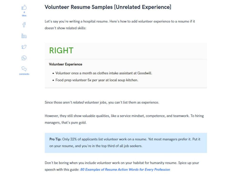
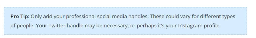
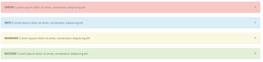
If your articles contain a lot of different tips and important ideas that should be highlighted among other content, it is better to give them all not in a single text with highlights in bold, but to provide special blocks in the text of the article, as is done here:
Examples and Definitions
Important tips and ideas are very good at visually dividing text into parts if they are highlighted with a colour, border or font, like:

or
Additionally, you can still add bold highlighting and, depending on the tip, give different highlight colours if it looks good in your design, as in the examples below:
Examples and definitions
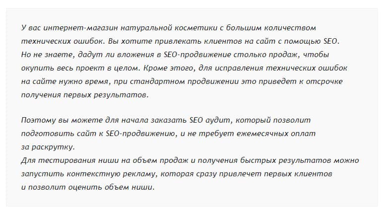
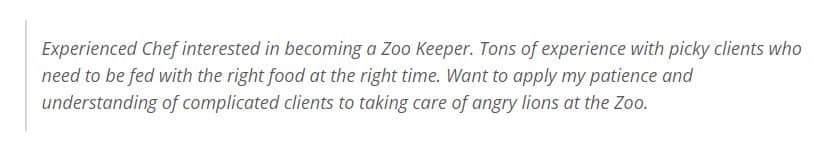
In several topics, such as marketing, descriptive examples are often provided. This makes texts more understandable and sometimes even more personal to the reader. However, examples presented simply as part of the main block of text will be poorly perceived, as they may be several paragraphs long and lack emphasis. It is best to emphasise such examples with a frame of some kind (either around the perimeter or on one side). You can change the font, the background colour of the whole block or the colour of the text in these blocks to clearly show that the whole block, despite the division into paragraphs, is a single whole and stands out among other content. Therefore, the site should be able to show such a thing, for example, like this:
The second option of highlighting with an incomplete frame:
If there are definitions for terms in your text, they should be highlighted in a separate block, as well as examples, and perhaps also highlighted in colour. This will make them stand out even more among all the other blocks with examples. For example, like this:
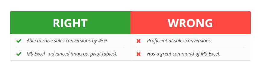
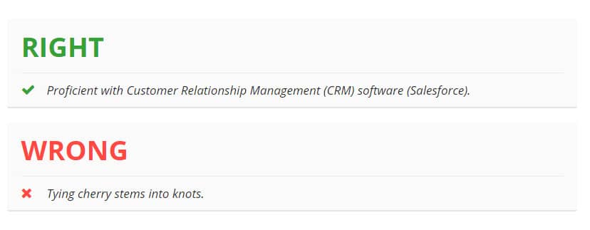
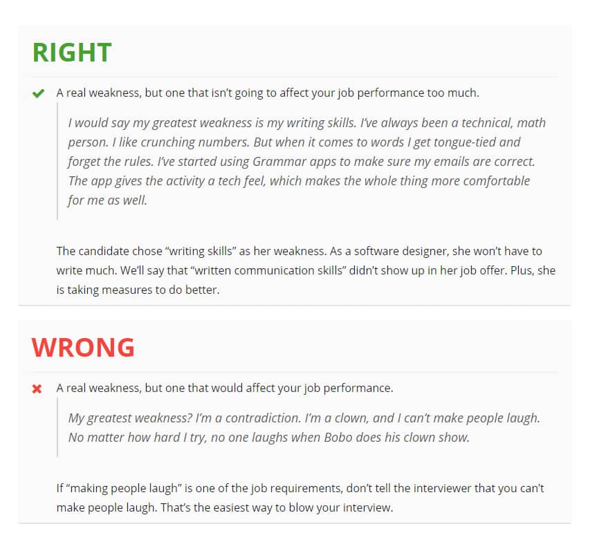
Right/Wrong Blocks
There are several topics where you can provide examples, both negative and positive, when writing an article. And to emphasise this to readers, you can use different variations of the right/wrong (advantages/disadvantages) block depending on the content (example):
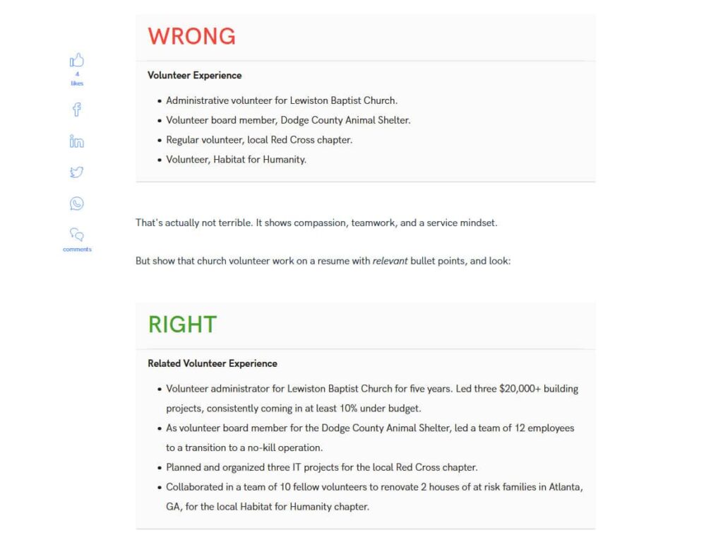
If you have to add examples and explanations to your examples, you can make such complex constructions, where you combine the design elements of example blocks and right/wrong blocks:
Such solutions are not common; nevertheless, some themes have them, and if this is your case, you will have to do it. By default, such blocks are usually not included in the design, so you will need to further refine this point.
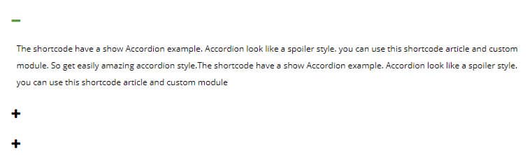
Accordions and FAQ
If you need to give additional information in an article, but don't want it to take up a lot of space, format it as an accordion like this:
This technique is especially often used when designing an FAQ (question-answer) block - the text of the question will be the title of the accordion item, and the answer will be in the drop-down part. Example:
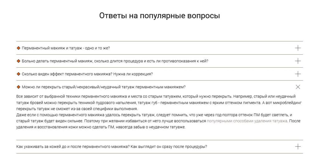
Usually, the block title itself is highlighted with the h2 tag, but the questions can be highlighted with the h3 tag or generally just given visual emphasis (e.g. bold or colour).
Tabs
If you need to show multiple content blocks in a compact way, tabs are a good option. For example, as on Schema.org:
With the help of tabs, you can show blocks of before/ after, several variants of the realisation of one and the same task or simply wrap different semantic blocks.
In such a layout, you will give the user maximum information, and each alternative will be in a separate tab. The user will not need to look through all the alternatives - he will choose and consider the variant he is interested in.
This block is not present in many CMS by default, but in some of them it is easily implemented through shortcodes. The main thing is to make a design for them in advance and choose the most suitable option:
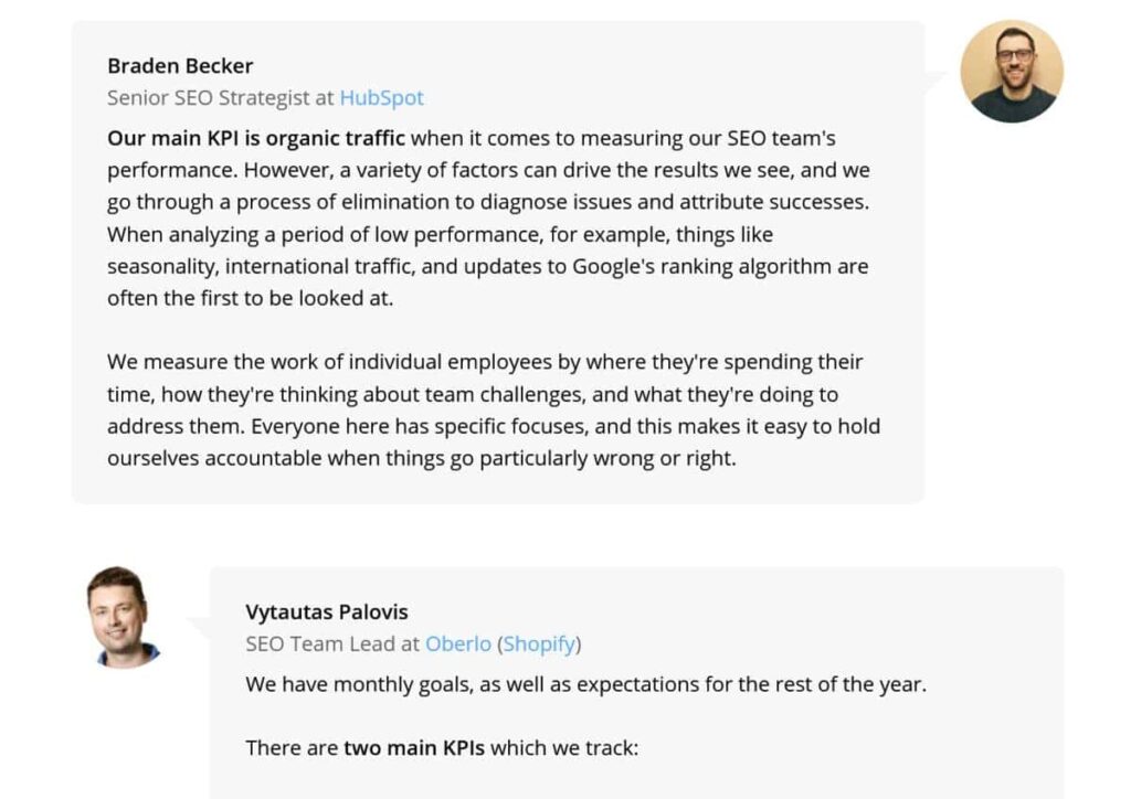
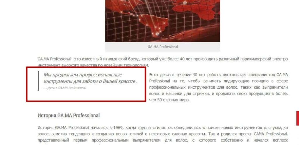
Quote block
When designing blog articles, quote blocks are often used. An entire article can be created on the basis of experts' answers to questions of concern to the audience, for example:
You can also work with quotes from only one expert, publishing them as the article progresses.
At first glance, it may seem that this type of design is not relevant in online shop blogs. But this is not true, in reviews of specialised products, comments from famous people or experts will be more than useful (for example, when reviewing pads and bases for table tennis rackets from famous athletes in this subject).
If your topic includes content with quotes, don't forget to provide a block for it. For example:
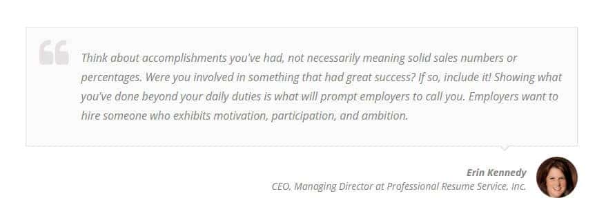
Such a block should highlight the author's comment text, have the option to show their name, brief information about them and a photo (optional). Example:
This variant even uses quoting not on the entire line of text, but as a side block, which does not look good in all article designs.
Conversion Elements in Articles
Most blogs are created not just to give information on a topic or record your thoughts, but to make money. If you have a blog of a shop or service site, your goal is to make a purchase, order a service or get in contact with a manager. If you have a blog or at least separate articles for an affiliate, your goal is to attract the user to follow your link to the affiliate's site and order a product or service there.
In all these cases, it is not enough to simply mention this or that product as a text link - such a link is much less likely to be clicked. And you need to create a more powerful stimulus for the transition.
For this reason, you should make selling elements for articles or conversion forms for contacts. Usually, such elements stand out from the rest of the content and, on the one hand, add variety to the article, and on the other hand, increase conversions. Not only that, these elements should not only be in the footer and other cross-cutting elements of pages, but can also be located in the right places of the article, where they are more relevant.
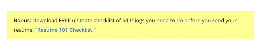
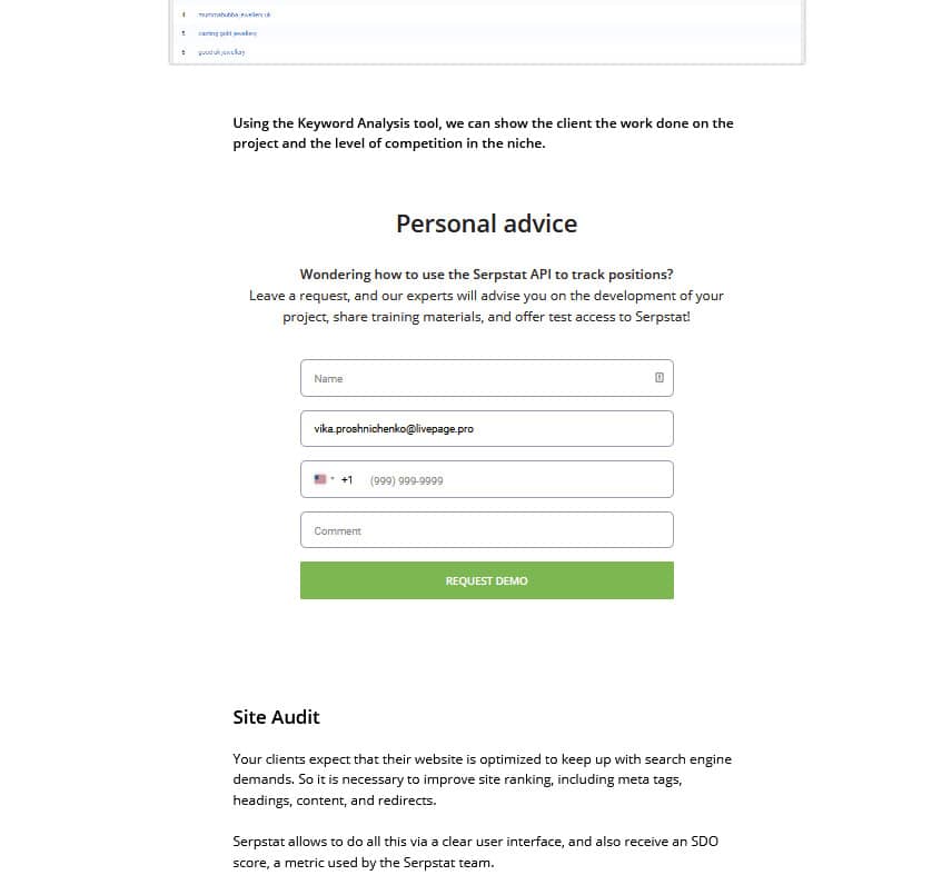
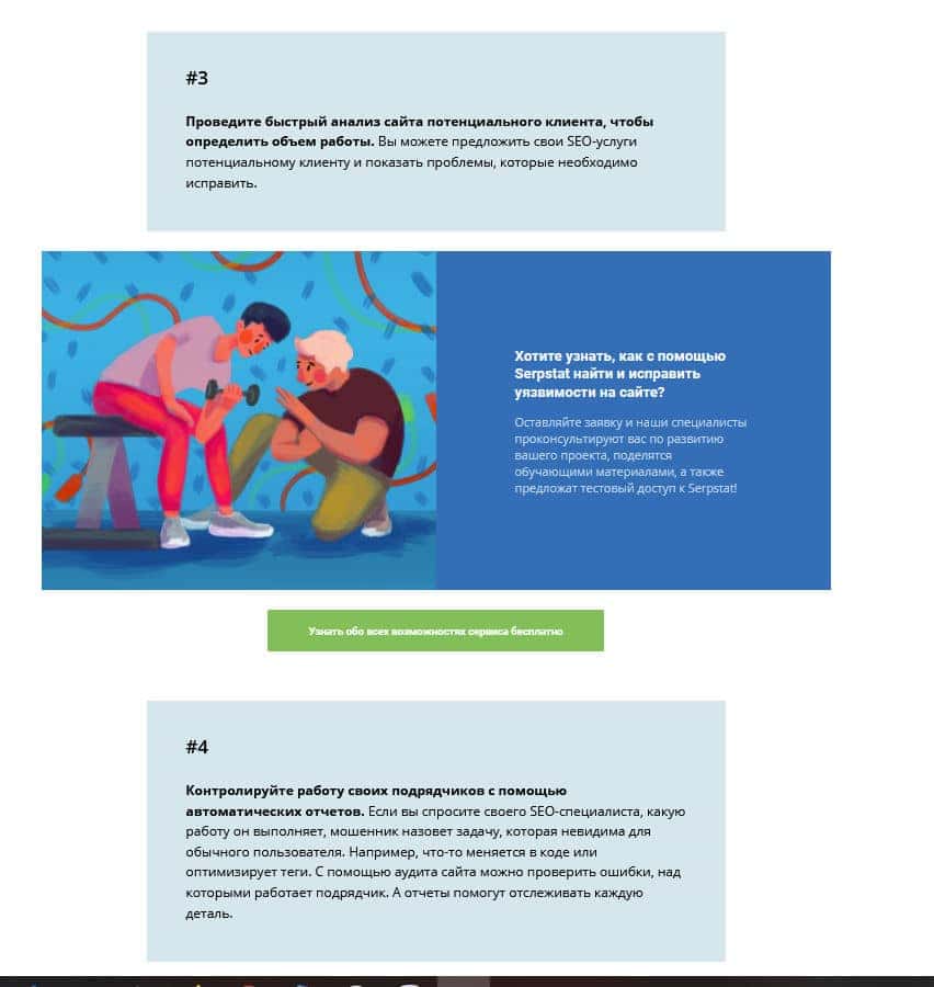
For example, it can be a block at the end of the article, collecting contacts in exchange for something useful, like this:
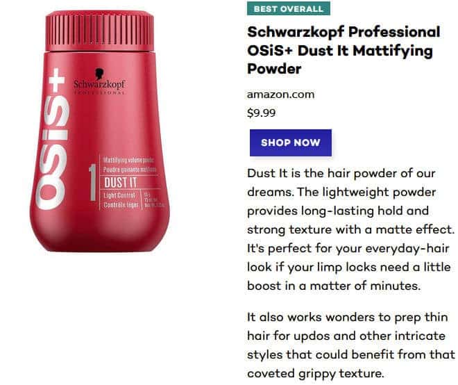
Or an element at the end of the article with the products discussed, for example:
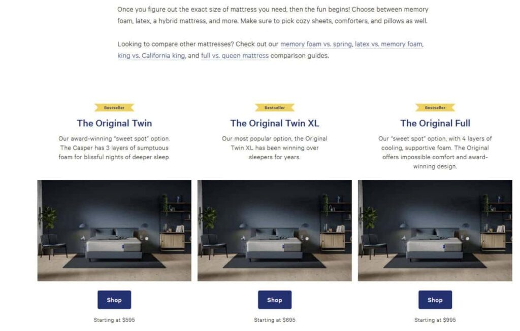
It is desirable that these blocks are not just pictures and links, but full-fledged indexable HTML blocks, each containing:
- a small picture;
- text offer;
- A button with a call to action, which, when clicked, opens a form created for the corresponding offer.
Apart from the end of the article, such blocks can be more relevant to the user through text alone. Therefore, it is worth considering this in advance, preparing templates of elements with a beautiful design by the designer and programmer, and then using these blanks. Example:

The article was simply interrupted by a paragraph and given a selling block.
And here's a similar example with a form (that pops up when clicked):

Or here:
!!! Please note: depending on the capabilities of your CMS, programmers can implement such elements in different ways. Someone can simply create a complete HTML code template in one of the articles, where you will only need to change the text and links in the template code and then publish it. But you need to know at least the basics of layout to control the work or correct it all yourself. Alternatively, the programmer can install a plugin or shortcode module and debug its display according to the design. Then you will simply prescribe the necessary URLs and texts to the shortcode in separate fields, and the whole design will be adjusted to these edits. And to work with this option, you will not need to study in-depth layout, but only need to master the special commands for calling shortcodes. Of course, the second option is more convenient from the user's point of view, but, alas, on many CMS, such implementation is impossible or very expensive, so the first option can be used there.
In addition, it should be possible to change the text, headings, photos, and address in these blocks from page to page in order to provide relevant content for the article. That is, on one page, this form should send one result after processing, and the other form should send another result (the one we specify in advance when laying out the page with the block).
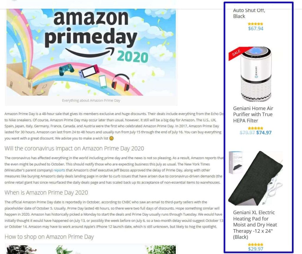
For Amazon review sites, this option of arranging products right in the text of the article can work well:
There is another quite popular option for the design of items on a shop blog, where items are pinned and move when scrolling down the article behind the user, like this:
This option has the right to exist, but there is one "but" in its implementation: in most cases, with adaptive layout, this blog is programmed to be hidden on mobile devices, because there is no space on the screen for it. In such a case, it is hidden, but since most site users visit from mobile devices, almost all of them do not see this block and, therefore, cannot use it. Therefore, for such solutions, it is very important to carefully consider how to present the product, and it is sometimes easier to do so through the blocks of goods in the article's text, as in the above proposed options.
Code Snippets
It's no secret that most IT and marketing companies are promoted primarily through blogs. In articles on such topics, it is often necessary to show a fragment of code or layout styles. And this is where the problems begin. Without special add-ons, most blog engines process all code fragments in their own way: replacing characters or deleting them. This phenomenon is not uncommon in popular CMS systems like WordPress. And even if you are lucky, set up the site so that it does not process anything; otherwise, quite large code fragments, which may be important as examples for articles, will not be well-organised in the text.
To show fragments of programme code or layout normally in the text, you should look either towards third-party solutions that are simply embedded in the page code, or like YouTube videos, and allow you to show everything neatly, like codepen.io:
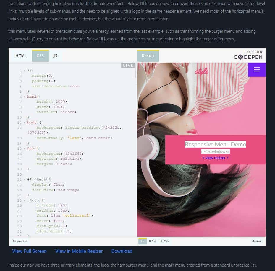
Or look for special plugins of the site engine.
But in any case, when using such solutions, do not forget that all of them should be convenient on mobile, and in addition, for large blocks of code should make a height limit and internal scrolling, so that it does not lay out a long sheet, but at the same time it could be copied and studied.
Common design mistakes
Although the described topic is not new, you can still find many sites that have the following errors:
- Overdone design in text and visual elements:

- Too much indentation that interferes with reading:
Difficult to read fonts in the design of even headings - this looks beautiful, but makes users tense while reading:

- Fonts that are too large or too small: